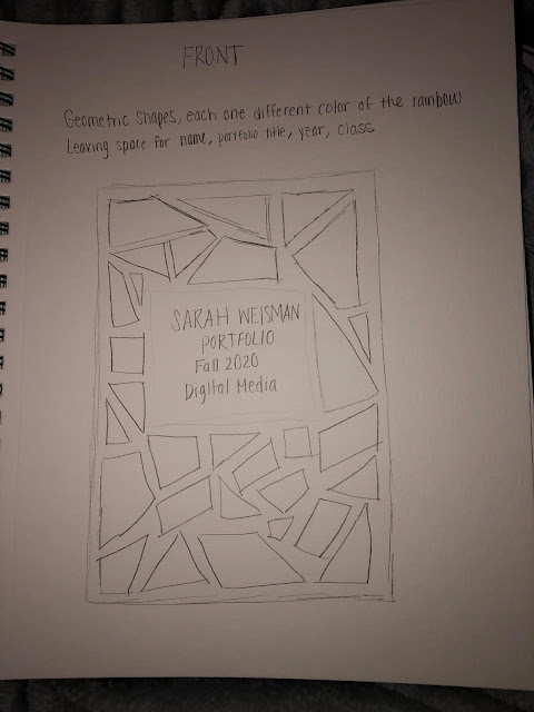
Posts

Showing posts from November, 2020

PORTFOLIO

Image
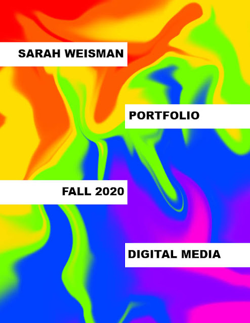
DIGITAL MEDIA PORTFOLIO Throughout this course I have been challenged to use my creative skills in new ways through different programs.  I enjoyed creating my own pieces of art (with guidelines of course) and expressing myself.  This portfolio is a way to present all of my pieces in one concise place.  I am really happy with my progress I have made in this course and I have learned so much about what I want to do in the future.  I definitely want to continue with my major that I chose.  I feel like I can do a lot with designing and different projects for a job in the near future.  I have come a long way since the beginning of the semester and I am extremely satisfied with my portfolio.

Sketches for Portfolio

Image
  Sketches for Portfolio For my portfolio sketches I wanted to do something creative for my front cover and back cover.  I decided to go with a geometric shape theme for those 2 pages.  For the table of contents, I want it to look like a polaroid but I will have the page numbers assigned to each project.  I will have 2 pieces of artwork on each page with my artist statements about them.  Using InDesign to create my portfolio will be challenging but fun and worth it in the end. 

Magazine Callout

Image
 Magazine Callout     For the magazine callout I made the title in a fancy font to emphasize the article.  I then changed the font and color of the callout quotes and placed a black frame around the quotes.  I placed the first photo in a circle frame because I thought it went well with the font I chose for the title.  For the second photo I kept it rectangle so it fit with the text.  I can't wait to explore more with InDesign and make my portfolio neat and well planned.  

Business Cards

Image
Business Cards     When I started designing my business cards on InDesign my creative side took over and I changed things up a little.  My plans changed once I started playing around with the program.  For the first card, I decided to make the background purple and only put one logo at the bottom instead of two in the top corners.  For the second card I added my name on the front and for the back I decided to only do polk a dots on the sides so it was not chaotic.  For the third one, I went a completely different route from my sketch but I really like how it turned out.  Also, for all of my cards I switched up the colors a little so it was aesthetically pleasing for my viewer's eyes.   Card #1 Card #2 Card #3  MY SKETCHES        For my sketches, I took a simplistic approach to it.  I wanted my cards to have a simple yet formal design to them.  The first one has simple lines on the back around my logo and I would use purple, black and white for this card.  The second card would have

Postcard

Image
  Postcard            For my postcard I decided to make it from the zoo in Tampa.  The zoo is called ZooTampa at Lowry Park.  I think the pattern I chose for the background is really intriguing and will attract people.  When people receive this in the mail they will see the bright colors and be happy to see that it was from their friend or family member.  I placed my logo under the location on the front and next to the name of the zoo on the back.  I made it pretty small so it did not take away from the post card design or message.        

Pumpkin Extra Credit

Image
  Pumpkin Extra Credit Total time: 1 hour     For my pumpkin creation I decided to make a zombie standing outside the entrance of a cemetery.  To do this, I placed the zombies body on the background and erased his head.  Then I masked out the pumpkin from its original background and placed it on the zombie.  I modified the pumpkin to make it a reasonable head shape and size.  Next, I used the quick selection tool to select the face from another pumpkin and I placed it on the head.  Finally, I put my tag brush on the doors.  There were holes on the doors and I removed them by using the patch tool.  I warped the tag brush to make it look more realistic.  Overall, I really like how this came out.  I think my zombie with the pumpkin head is really cute.   The images I used:

Business Card Sketches

Image
 MY SKETCHES        For my sketches, I took a simplistic approach to it.  I wanted my cards to have a simple yet formal design to them.  The first one has simple lines on the back around my logo and I would use purple, black and white for this card.  The second card would have polk a dots on the back surrounding my logo.  The colors I would use would be light pink, gray and black.  For the final sketch I would create a triangle theme on the front and have little triangles on the back with my logo.  Hot pink, light pink and black will be included in this card.  

InDesign Links

  InDesign Links Pen Tool https://www.youtube.com/watch?v=weg2Lyh__IE     This tool is mainly to draw things for your design.  You can draw any custom shape with this tool.  You create anchor points while drawing you shape or line.  Hold and drag to create curves.  You can right click on the pen tool to add anchor points that you forgot to add or want to modify you design.  You can select one anchor at a time and move it around.  You can add stroke and fill after you make you design with the pen tool.  This tool can be helpful when creating your own design.  It allows you to have freedom with what you want to draw and you can use your creativity. Working with Text https://www.youtube.com/watch?v=zq1ExDcGrDQ      This is the text tool.  You create a text box and can begin to type.  You can increase and decrease the size of the text.  You can change the font of the text you have typed.  You can skew your text to make cool designs and create different spacing between letters and words.  A

Somewhere

Image
 Somewhere Total time: 1 hour I decided to photoshop myself into the Cheaper By The Dozen family.  I got inspiration from the previous assignment we did.  I saw a bunch of girls in a photo and the artist photoshopped himself next to them.  I thought this was funny because it actually looked pretty real.  When I found this photo of the family it struck my imagination.  This family has a lot of kids so why not add one more.  They probably would not even notice.   When I created this, I used the quick selection tool to select myself out of my original photo which is below.  After selecting myself I feathered the edges and made it seem seamless.  Then I copied that layer and pasted it on the family photo.  I put the little boys leg over mine so it looked like my leg was behind him.  I made his shoulder go behind mine so it looked like I was apart of the family.  

Pre-Somewhere For Inspiration

Image
Pre-Somewhere For Inspiration #1 https://www.instagram.com/kirbyjenner/?hl=en I believe this photo would be hard to photoshop myself into because I would have to get the correct lighting and shadows to match the rest of the photo.  Kirby makes it seem so effortless.   #2 https://www.instagram.com/averagerob/ When I was looking through Average Rob's instagram posts I saw this photo and it reminded me of a movie with a lot of kids.  I was inspired by this photo for my project.  I want to photoshop myself into a cheaper by the dozen family picture.  I think it will be funny because they already have a lot of kids so why not add one more.   #3 https://www.boredpanda.com/funny-photoshop-troll-james-fridman/ I thought this photo was funny because James turned the whole man around and even covered the little girl.  I also thought it was funny that the artist didn't even remove the man in the striped shirt.   #4 https://www.boredpanda.com/reality-behind-photography/ When I saw this pho

Autoscopy

Image
 Autoscopy Total time: 3 hours     My inspiration for this was the movie The Purge.  It is the end of October and I wanted to make something spooky and halloween sparked my imagination and I began creating this by using photoshop.  It was fun playing around with the filter gallery and making it all come together.  I also used the liquify tool which added a creepy feel to my creation.  I created two final products because I could not decide which one I liked better.  Overall I am very happy with my final result.